
Using colour at home: how to create a colour palette
Discover how to create a beautiful, harmonious colour palette in your home. Learn the fundamentals of combining colour, and how to choose shades that suit your home’s style perfectly.
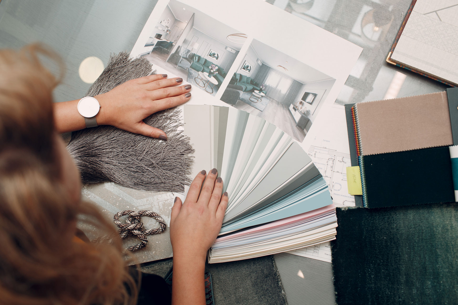
Would you like to create a beautifully coordinated colour palette in your home, but feel unsure about how to combine the different shades? In this guide I will help you set those doubts aside and walk you through the process of choosing colour, from the fundamentals of colour theory to the practical steps. You will learn how to compose a harmonious set of colours that suits both the space and your own style.
How colour shapes the mood of a home
When you set out to choose colours, the first and most important step is to answer a few basic questions about the function of the space:
- What is the purpose of the room?
- What mood would you like to create?
Think through how you want to feel in the space — this goes a long way towards defining the right colours. The colours you choose for a home have an enormous effect on its atmosphere, so before you set off for the paint shop, it is worth taking the time to picture the mood you want to create for yourself, your family and your guests. That will be the foundation of the palette.
A living room, for instance, might be restful and calm, while a study benefits from colours that support concentration.
How colour flows between rooms
Consider how colour travels from room to room to create a coherent whole. Walk through the different spaces of your home and observe how they connect visually. Harmony matters particularly between rooms that open onto one another, and above all between spaces that can be opened up into a single area.
Different colours create different moods in a space and evoke different feelings — whether excitement, calm, a restful atmosphere or even a sense of mystery. The right colours do not simply transform a room; they can also make it feel more spacious, warmer or more welcoming.
How light affects colour
Light plays a fundamental role in how we perceive colour in a space. The same paint colour can look entirely different from one room to the next, or under different lighting conditions. This is why I always recommend obtaining samples and testing them in various places and at various times of day. Experiment freely before you make a final decision — begin with a small area.
Working with the existing elements
Before you choose the wall colours, if you are reworking an existing space, it is worth taking into account the fixed elements already in your home, such as the flooring, the cabinetry or the larger pieces of furniture. Those colours automatically become part of the palette, so it matters that they sit well alongside the new ones.
Using neutral colours
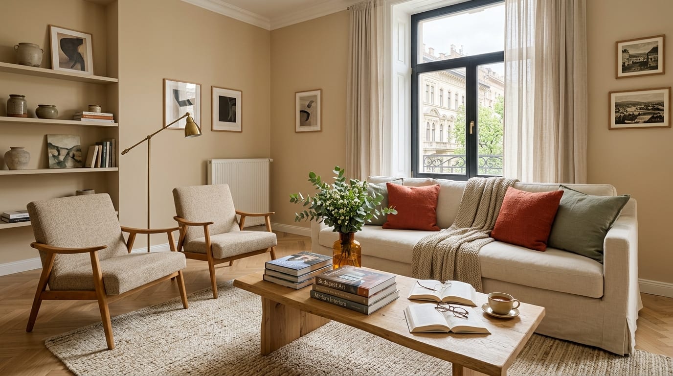
Neutrals such as white, beige or grey provide an excellent foundation for a palette. They leave you room to experiment with bolder colours in the accessories and decorative pieces. Because of their low chromatic content, neutral shades are never intrusive — they serve instead as a kind of canvas that allows the other design elements to come into their own.
When you are choosing among neutrals, it is important to decide whether you want warm or cool shades. That choice is influenced by the character of the space, the style of the room, the accent colours and the furniture as well.
Colour theory and colour schemes
Before you begin selecting colours, it is worth understanding the fundamentals of colour theory. Hues fall into three main categories: primary, secondary and tertiary colours. These form the basis of every colour scheme.
Tints, tones and shades are created by adding white, grey or black to a colour:
- if you want to achieve a lighter version of a colour, you need to add white,
- tones are made by adding grey,
- while darker shades come about through the addition of black.
These techniques help you to create depth and variety within the palette.
Building colour palettes — with the help of online tools
To get to know colour schemes and pair them up, it is worth using Canva’s colour wheel. Personally I am even fonder of Adobe’s colour tool, which offers an easy-to-use interface for both interior and graphic work.
A few types of colour palette
Monochromatic scheme
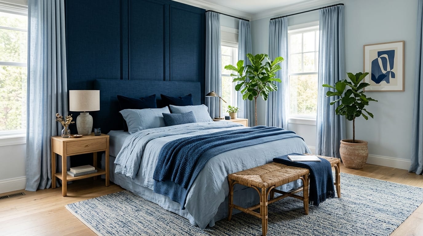
You work within a single colour, using its various tints and tones. Although this is simple and harmonious, it can occasionally feel one-dimensional — to make it engaging, it is worth adding texture and pattern. If you use a monochromatic blue, for example, you can work with several different shades of blue and soften the space with timber surfaces or plants.
Analogous scheme
You pick two or three colours that sit next to one another on the colour wheel and therefore harmonise naturally. Red, orange and yellow together, for instance, create a warm and welcoming space. It is particularly useful when you do not want strong contrast but would still like the space to stay visually interesting.
Complementary scheme
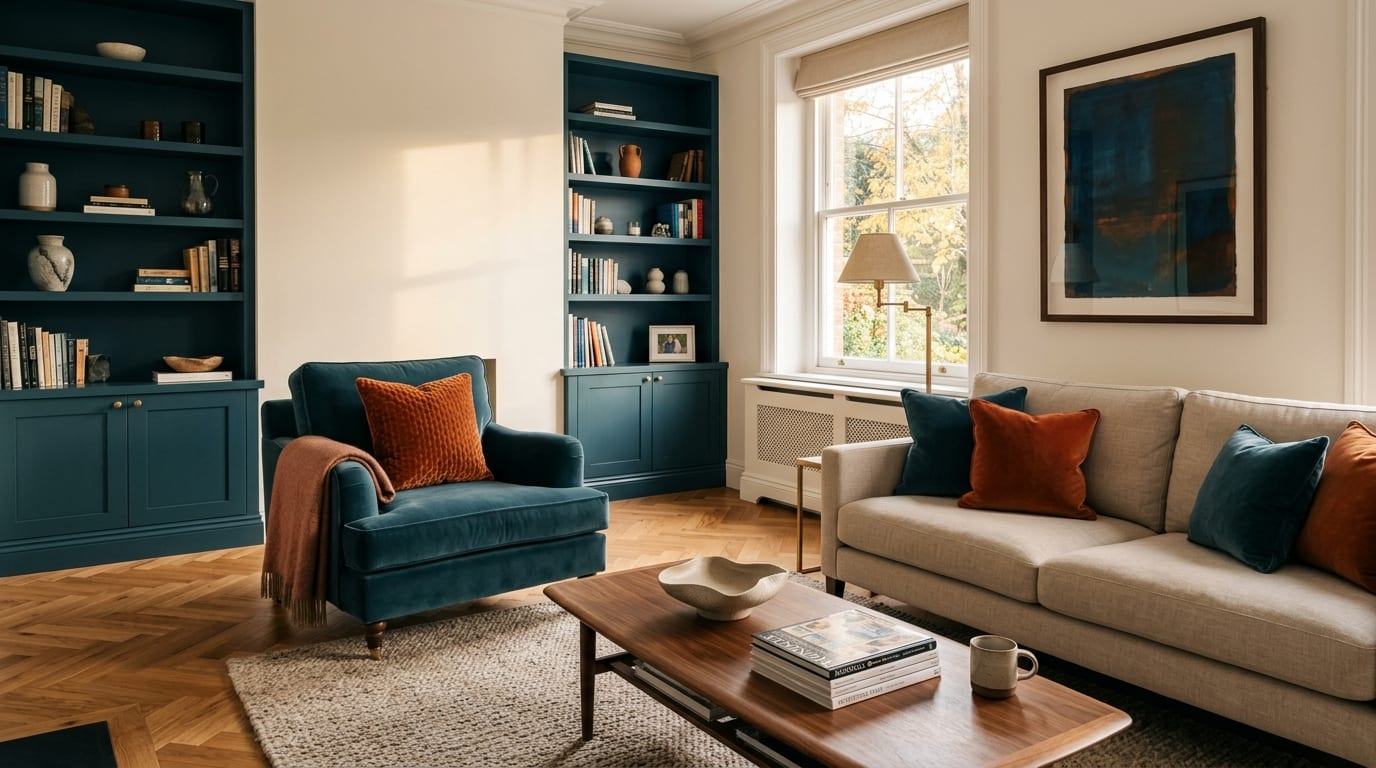
This uses two colours that sit opposite each other on the colour wheel, such as blue and orange. It creates strong contrast, which makes a space lively and dynamic, and it opens up the possibility of combining warm and cool colours.
Split-complementary scheme
You choose a main colour, then take not its direct complement but the two colours flanking that complement. This results in a gentler, more agreeable contrast. It works especially well in spaces where you want to create balance without overly strong contrasts.
If you use a complementary or split-complementary scheme, you have most likely already combined warm and cool tones. With monochromatic or analogous schemes, however, it is particularly important to make sure that both are present.
Before you start pinning down the exact colours, it is worth gathering inspiration. Browse Pinterest, put together moodboards, or draw ideas from your favourite places. If you find an image that inspires you, the Canva Color Palette Generator will build a palette from it automatically.
The 60-30-10 rule
It is worth treating the 60-30-10 rule as a guide; it helps you distribute the proportions between colours correctly. A dominant colour should fill 60% of the space (the colour of the walls, for example), a secondary colour should account for 30% (the furniture, say), while the remaining 10% should be an accent colour (cushions, decorative pieces). These proportions ensure that a room stays harmonious and visually balanced.
Rhythm as a design principle
The essence of rhythm as a design principle is to create coherence in a space through repeated forms, colours, patterns and textures. If you use a particular colour, it is worth bringing it back in different elements — in the form of a blue throw, a blue cushion and a blue vase, for instance. Repeating the colour establishes a rhythm that helps hold the space together, while the variations sustain visual interest.
A well-considered colour palette is not only attractive to look at; it is also right for the space in functional terms. If you follow the principles above, you can be confident that your home will convey harmony and balance.