
Kitchen cabinet colours: how to choose something that still works in ten years
The kitchen front is the most expensive colour decision in the home. Orientation, material pairings, one or two tones — a system you cannot get wrong.
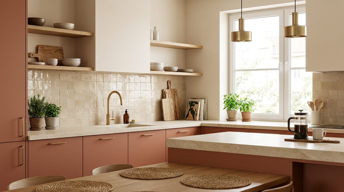
The colour of the kitchen cabinetry is the most expensive colour decision in the home. A wall colour you can repaint over a weekend if you tire of it — the kitchen fronts you cannot. So the question here is not what appeals to you today on a screen, but what will age well over ten years in your kitchen, in your light.
The good news: this is not a lottery of taste but a system. It consists of three decisions — tone, material pairing, finish — and each of them has a few rules that stop you going badly wrong.
Key points
- The colour is chosen by the light in the kitchen, not by the catalogue: with a north-facing aspect the warm tones work, with a south-facing one almost anything does.
- The safe formula: one colour + one timber + one metal — and all three carried through consistently.
- Matt and satin finishes are forgiving; high gloss in a dark colour is the most demanding combination.
- The two-tone kitchen (dark below, light above) lifts the space optically — it works even in a small kitchen.
Start with the light, not with the colour
The same front is two different colours in two different kitchens. In a north-facing space with cool light the greys turn blue and the cool greens fade to grey — what is needed here is a warm base: greige, sand, warm white, walnut. A south-facing kitchen with warm light takes almost everything, and it even warms up the cooler tones.
The practical test is simple: ask for A4 samples of the candidates and live with them in the kitchen for a week. Look at them in the morning, at midday and in the evening — and under lamplight too, because for most of the year you use the kitchen in the evening. Our colour palette article goes into the relationship between orientation and colour in more detail.
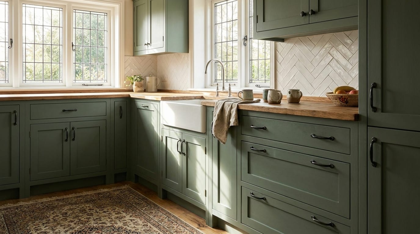
Four pairings that are certain to work
Kitchen colour never stands alone: the worktop, the metal and the wall together produce the picture. Four proven combinations:
The logic is the same in each: a saturated or dark front takes a pale, quiet worktop and a warm metal; alongside a restrained front the worktop can have more character. The two elements never compete — one of them always steps back.
A kitchen in one colour or in two?
The two-tone kitchen — a darker lower run, a lighter upper one — is not a fashion trick but an optical device: the heavy colour keeps the centre of gravity low, the light colour above lifts the ceiling height. It works particularly well in small and medium kitchens, because the upper run practically disappears into the wall.
| Approach | When it works | What to watch |
|---|---|---|
| One colour, light | A small, darker kitchen | The character comes from the worktop and the metal — without them it is sterile |
| One colour, dark or saturated | A large, light space with good daylight | In a matt finish; in a small space it closes things in |
| Two-tone (dark below, light above) | A medium kitchen with normal ceiling height | The horizontal line of the change should be consistent |
| Front plus timber combination | Almost always | The tone of the timber should either match the floor or differ from it deliberately |
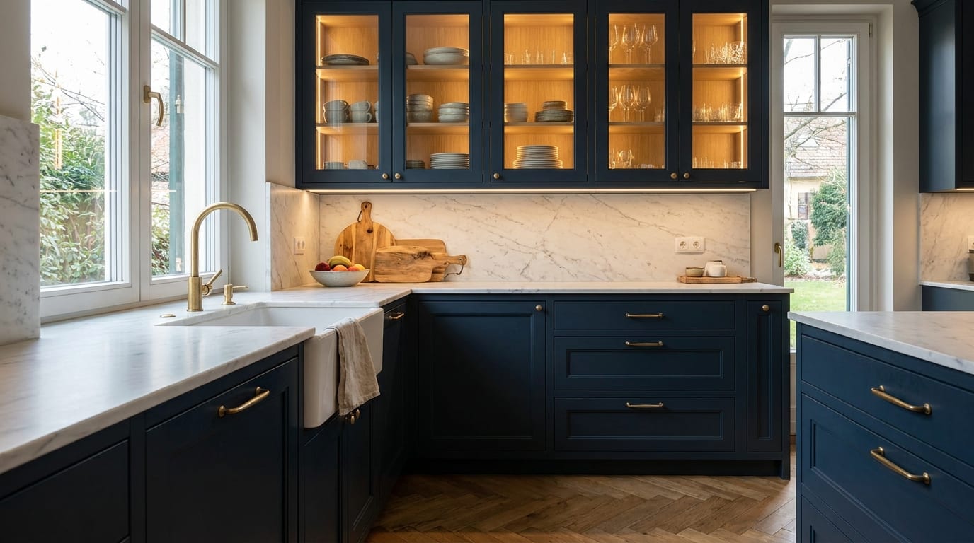
The finish: matt, satin or high gloss?
The finish is at least as decisive as the colour itself — and in everyday life it is more so.
Matt is elegant and forgiving: it does not reflect and it hides fingerprints. With a dark colour it is practically compulsory. Satin is the best compromise: its slight sheen makes it easier to clean, but it is not yet a mirror. High gloss in a light colour opens the space up and bounces light around — in a dark colour, however, it magnifies every fingerprint, scratch and ripple. Dark high gloss is only for those who are happy to wipe down every day.
What ages well — and what does not?
Over ten years, kitchen colours divide into two groups. Everything that comes from nature ages well: the tones of timber, the greiges, the deep greens and blues, the warm whites. These are not the fashions of a decade but interior colours that have lasted centuries.
What ages quickly is whatever bears the imprint of a period: cool high-gloss white belongs to the 2010s, the purple and red accent front to the 2000s. If you long for a strong, current colour, put it where it can be changed cheaply — on the wall, in textiles, in accessories — and let the durable layer stay on the fronts. We have a separate article on green kitchen cabinetry, with shades and pairings.
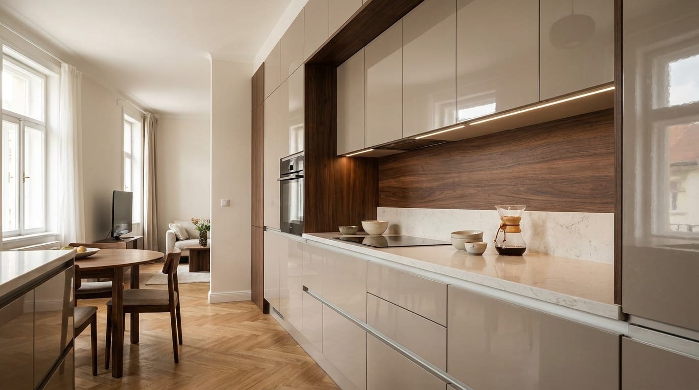
The handle and the wall: the last two brushstrokes
Metal is the jewellery of the kitchen: brass for the warm and saturated colours, matt black as an outline for light fronts, chrome and brushed steel for the cooler palettes. There is one rule: no more than two metal finishes in a kitchen — the tap, the handles and the lights should belong together.
And the wall colour should not repeat the front: let it differ by a shade or two, or be a quiet neutral. A front and a wall of the same colour merge into one another, and the kitchen cabinetry loses its outline.
Five mistakes we see when kitchen colours are chosen
- Deciding from a screen. Every display shows something different — only a physical sample counts, in the light of your own kitchen.
- Deciding from a small sample. Over a large area every colour is a degree more saturated and darker.
- Dark high gloss. The most beautiful surface in the showroom and the least rewarding one at home.
- Three or four metal finishes. A chrome tap, brass handles, a black light — together they are noise.
- Ignoring the floor. The tone of the front timber and the floor should either match or differ deliberately and distinctly — almost-the-same is the worst of all.
How the decision goes
To sum up, the order in which you cannot go wrong: first the light (orientation, evening lighting), then the tonal family (a warm or a cool base), then the pairing (worktop, timber, metal and wall together), and finally the finish. At every step with a physical sample, in your own kitchen.
And if you cannot decide between two candidates: choose the quieter one for the fronts and take the stronger one to the wall or into the textiles. Kitchen cabinetry is for ten years — the wall can be repainted next year.