
Modern living room: ideas that make the space come together — not just fill up
A modern living room is not a furniture list but a system of zones, layers and light. Seating, storage, textiles and lighting — how it all comes together.
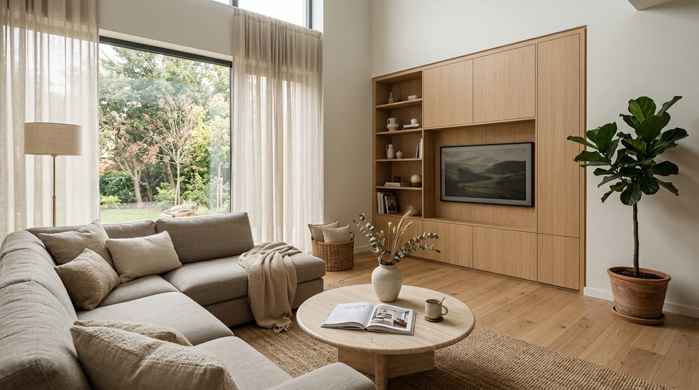
The living room is the space everyone already has a picture of in their head — and yet it is the one that goes wrong most often. The reason is rarely money. It is far more often that the living room comes together piece by piece: first the sofa, then a rug, then a lamp, and in the end everything is lovely on its own, but together it does not speak.
A modern living room is not a question of style but of system. This guide goes through the handful of decisions the system depends on — from the zones to the lighting.
The key points
- A living room is best planned not with furniture but with zones: seating, storage, circulation — and, if there is one, a work or play band.
- The size of the sofa is tied to the room, not to what the showroom offers: circulation needs a clear band of at least 70–80 cm beside it.
- There is no modern living room with a single layer of light — you need at least three lighting layers.
- Character does not come from ornaments but from two or three materials carried through consistently.
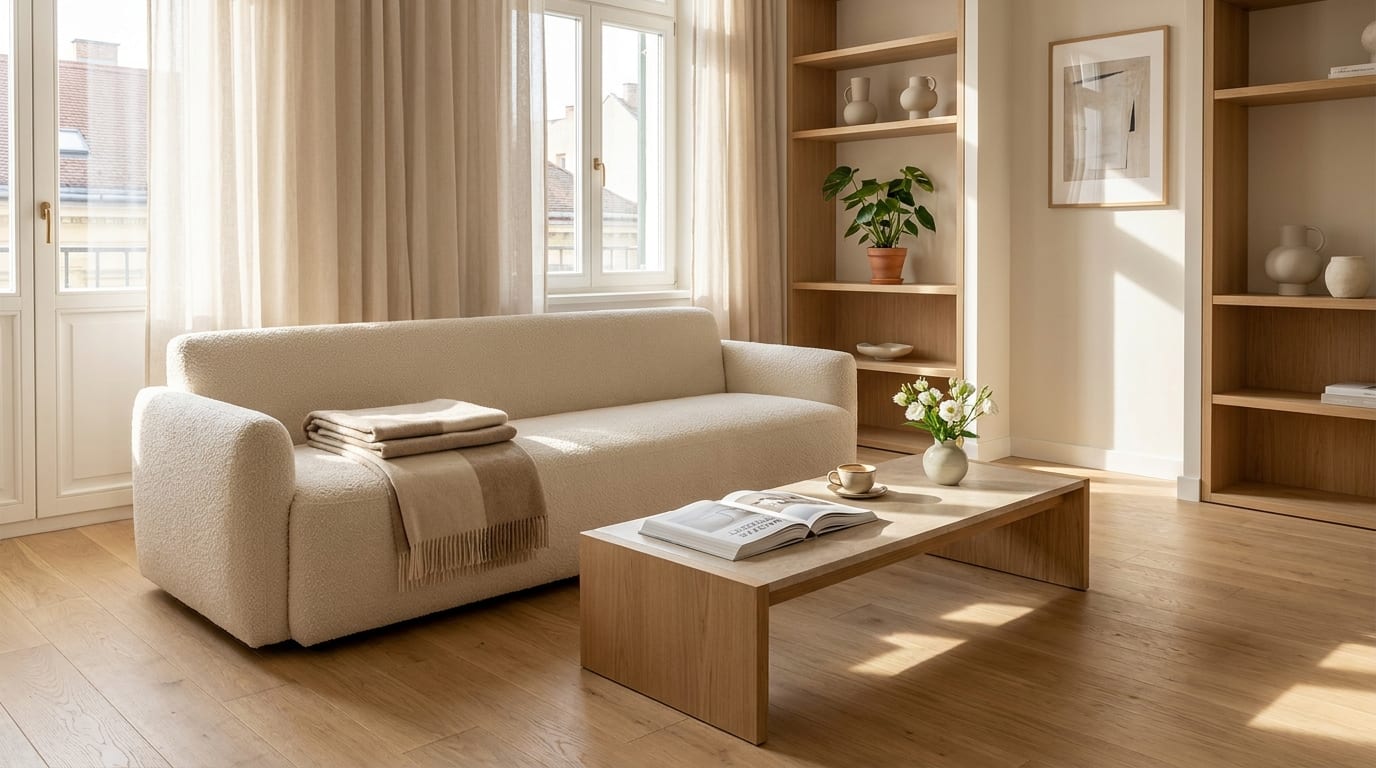
Start with the zones, not with the sofa
A living room works because it knows what happens in it. In an average family living room at least three things run in parallel: someone is watching television, someone is crossing the space, and something has to have room — toys, books, a throw, a charger. That is three zones: seating, circulation, storage.
The order matters. Draw the circulation bands first — where the family walks from and to every day — because those are not negotiable. What is left is the space for the seating zone, and the sofa follows from its dimensions, not the other way round. Storage gets wall surface, not floor area: more on that below.
The sofa: size, orientation, proportion
The most common mistake is a sofa that is too big. In the showroom every sofa looks small, because the space around it is vast — at home it then turns out that beside a 300 cm corner unit there are 40 cm left for getting past.
The numbers worth holding yourself to:
| Distance | Recommended value |
|---|---|
| Circulation band beside the sofa | at least 70–80 cm |
| Between sofa and coffee table | 40–45 cm |
| Between seat and screen | 1.5–2.5 times the screen diagonal |
| Between two people sitting opposite each other | 3.5 m at most — beyond that conversation breaks down |
Orientation matters just as much: if at all possible the sofa should turn its back neither on the space nor on whoever walks in. In open-plan spaces this is particularly sensitive — a sofa standing with its back to you builds a wall exactly where you did not want one.
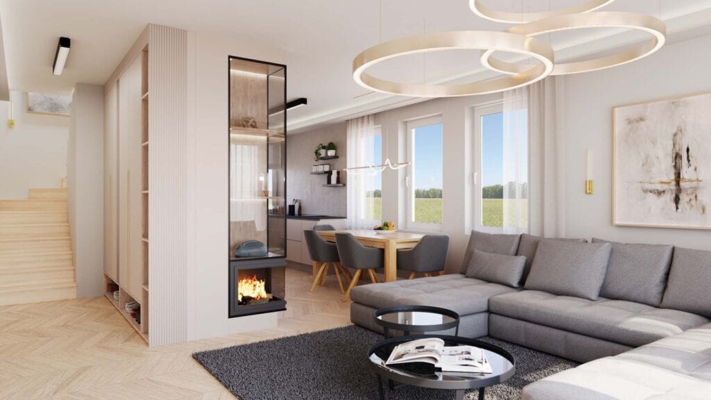
Storage: order is a question of design, not willpower
The airy feel of a modern living room does not depend on your owning few things, but on those things having somewhere to go. The answer is almost always built-in storage organised onto a wall: a media wall with closed fronts, a few open shelves for what is worth showing — and everything else behind a door.
There is a rule of thumb for the closed-to-open ratio that works well: no more than a third should be open. Open shelving decorates, closed fronts keep order — with the ratio reversed the wall turns into visual noise. Made-to-measure pays here too: a unit running to the ceiling not only stores more, it also makes the space look taller, as we set out in detail in our storage guide.
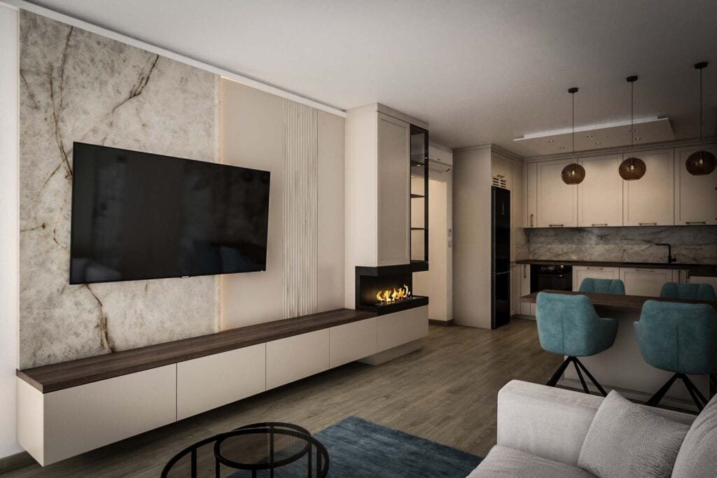
Lighting: a modern living room is decided in the evening
During the day almost every living room looks good. The difference emerges after dark: a space lit by a single ceiling light is flat and cold, however well appointed the furnishings.
You need three layers:
- Ambient light — recessed spots or a ceiling light, on a dimmer. This is the working light, not the mood.
- Task light — a reading lamp beside the armchair, light onto the shelves.
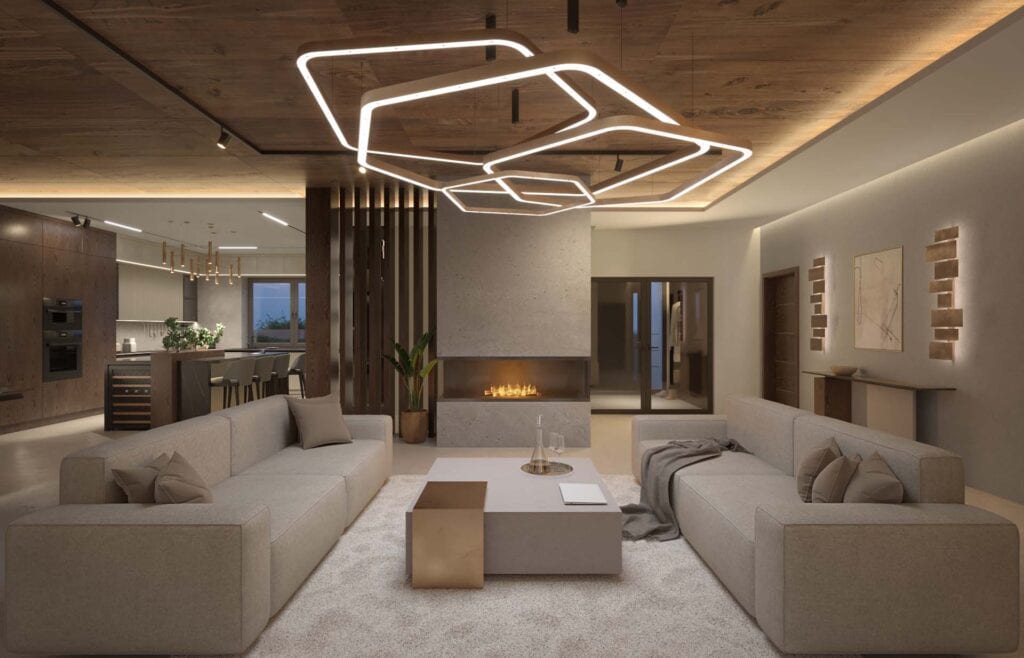
- Mood light — a concealed LED strip on the media wall or above the curtain track, low-sitting lamps. In the evening it is this layer that carries the room.
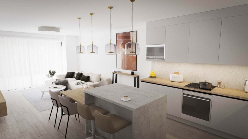
Keep the colour temperature uniformly warm white (2700–3000 K) — the layers can be mixed, the colour temperatures cannot. We set out the whole logic, switching circuits included, in our lighting design article.
Materials and colours: fewer, used consistently
A modern living room is not modern because everything in it is new, but because few materials are at work in it — and those appear everywhere. One recipe that works: one wood (on the floor, on furniture fronts, perhaps on wall panelling), one or two textile families (curtains, rug, cushions — different textures, related tones), and one metal that returns on the lights and the door handles.
A good starting point for the colour palette is 60-30-10: 60 per cent of the space a calm base, 30 per cent a secondary tone, 10 per cent an accent. Our colour palette article covers the exact proportions and how they relate to the orientation of the room.
The question of the television
The television is the delicate point of a modern living room: it is needed, but it is not the lead role. There are three respectable solutions: a screen recessed into the media wall against a dark background; a gallery-wall arrangement where the television sits among pictures; and a front that closes completely. What they share is the point — the black rectangle should not be the first thing the arriving eye lands on.
What is worth avoiding: putting the television above the fireplace. It is high to look at, and the two focal points cancel each other out.
Five mistakes we see in most living rooms
- Every piece of furniture pushed against a wall. The middle of the room becomes an empty no-man’s-land — the sofa is allowed to stand away from the wall.
- A rug that is too small. If only the coffee table fits on it, the zone falls apart.
- A single layer of light. A flat, cold space in the evening.
- Too many materials and colours. Lovely piece by piece, noise together.
- Forgetting the storage. An airy space fills up within a fortnight if there is no addressed place for things.
Coming together, or filling up?
The difference lies in the order. Whoever buys furniture ends up with a living room that fills up. Whoever decides on the zones, the lighting layers and the material palette first ends up with one that comes together — and after that choosing the furniture is easy too, because every piece has a role, a size and a place.
If the living room is part of a larger reworking, our piece on spatial organisation helps you see the logic of the whole flat at once.